
REDUCE REUSE REPEAT, A TURNIP GREEN CREATIVE REUSE FUNDRAISER
Reduce Reuse Repeat is an annual fundraiser for Turnip Green Creative Reuse, a local Nashville non-profit that takes monetary donations as well as provides a drop-off site for materials that might otherwise end up in landfills so that teachers, students, artists, anyone really can give these items a new life purpose. They have diverted several tons of garbage from the landfills of their community and continue to inspire others to Reduce, Reuse, Repeat!

TABLE TENT

TABLE TENT

TABLE TENT

TABLE TENT

TABLE TENT

TABLE TENT

SIGNAGE
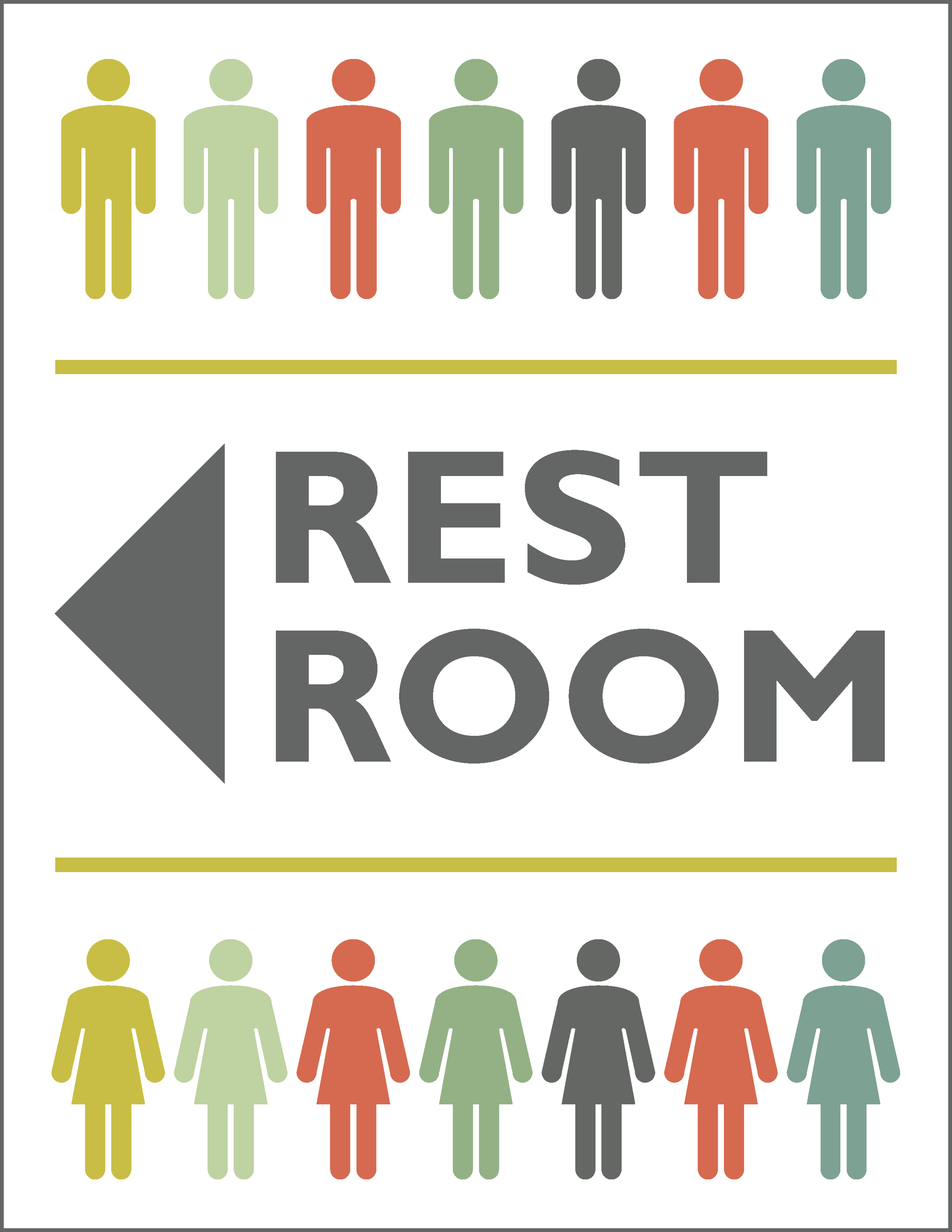
SIGNAGE
AMERICAN HEART ASSOCIATION MIDDLE TENNESSEE HEART GALA
As someone whose family has been impacted by heart disease, I was so honored to be a part of the American Heart Association of Greater Nashville’s marketing efforts for various events. These banners were created for the Middle Tennessee Heart Gala.

EVENT BANNERS
TENNESSEE HOSPITAL ASSOCIATION'S 2017 ANNUAL MEETING
Each year, THA held its “largest membership meeting which focused on educational and networking opportunities for healthcare professionals” with a theme that is carried throughout the marketing campaign and ultimately the event. Prior to 2017, many of the marketing materials (save the dates, invites, program agendas, etc.) were printed and mailed but more recently, these materials were distributed digitally. Deliverables included branding for the meeting's them each year, save the date graphics, ads, environmental graphics, agendas, programs (print and digital with hyperlinks) and more. The theme was front and center at the event with signage helping ensure attendees found their way.

BOOTH DSIPLAYS


WINDOW CLING DISPLAY


WINDOW CLING DISPLAY
TENNESSEE HOSPITAL ASSOCIATION'S 2016 ANNUAL MEETING

BOOTH DISPLAY
THE MEMPHIS JAPAN FESTIVAL
Creating branding has always been a large part of the Studio Haus history. After developing and building upon the recognition of the Nashville Cherry Blossom Festival’s brand over the years, my wonderful clients came back for the development of the Memphis Japan Festival’s branding which they began to manage in the fall of 2017. Since these two festivals are being managed by the same group, we decided it would make sense to give the Memphis Japan Festival a uniquely recognizable look while also having some graphic affiliation with the Nashville Cherry Blossom Festival. Nashville’s Cherry Blossom festival is held in the spring and the Memphis Japan Festival takes place in the fall. The colors and blossoms of Nashville’s springtime festival didn’t apply. Hence more fall-like colors and flora. Similar lettering and compositions of the two Festivals however DID make sense. We were so happy to display the fruits (or shall I say the Japanese Maple leaves?) of our labors with this new logo and promotional materials that showcased this new direction to a new audience of kids and adults attendance to the Memphis Japan Festival experience. These are just a few examples of the displays and way-finding signage created for the event.
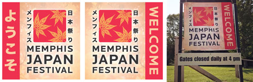
WELCOME BANNERS

DIRECTIONAL SANDWICH SIGN
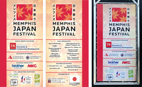
SPONSOR BANNERS

FLAG BANNERS

TENT SIGNAGE

DIRECTIONAL SANDWICH SIGN
THE ANNUAL NASHVILLE CHERRY BLOSSOM FESTIVAL
Every spring, the signs of blossoms sprouting from their buds and leaves unfurling from their branches mark the approaching annual event of the Nashville Cherry Blossom Festival. With nearly 10 years years of involvement with this festival, I’m proud to know that the brand we built together over these years has grown and continues to grow in its recognition among attendees old and new alike, as does its sponsorship. This includes the number of exhibitors, performances and of course participation and attendance in special events like the Cosplay Contest and Pups in Pink Parade. The Festival, “celebrating spring and Japanese culture,” is the first taste of this longed-for season’s blossoming after the cold, gray winter and was included in 2017’s Best of Nashville Events by Nashville Scene. Branding has included everything from the logo; promotional brochures targeted to exhibitors and potential sponsorships; ads (online and print); signage (directional and otherwise); event programs with a site map; flyers, social media graphics and more. It’s a wonderful event with enthusiastic exhibitors, food trucks and vendors, sponsors and attendees alike!

LIGHT POLE BANNER

BACKLIT SIGNAGE

FLAG BANNERS
SONGWRITER JERRY VANDIVER'S NORTHSTAR CANOE SPONSORSHIP PROMOTION
I’m proud to work with friends now and then to upgrade their graphics and being from Music City USA, this often means working with songwriters and musicians. Jerry Vandiver is a long-time artist in Nashville and all-around good guy. He even helps rescue and rehabilitate wild animals. I mean, just look at that smile—it lights up the stage!
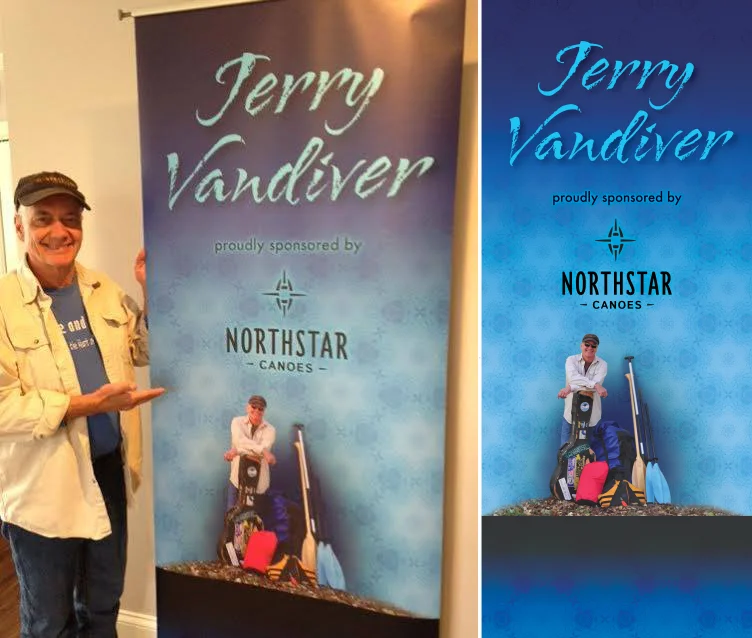
RETRACTABLE BANNER
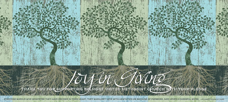
BELMONT UNITED METHODIST CHURCH'S FUNDRAISING CAMPAIGN
A one-time project with the message, “Joy in Giving,” provided just the right kind of encouragement to inspire the graphics.
BANNER
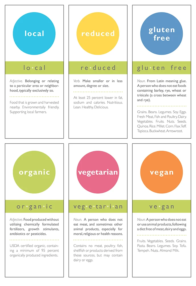
PEDESTAL FOODS SCHOOL CAFETERIA SIGNAGE
As a decades-long vegetarian, I love talking about the impacts food can make on people, communities and the world. However, there are better spokespeople to do this than me. This project was a joy to develop graphics for. This school cafeteria signage was meant to help kids learn the differences between terms was just one step in that process which also included other marketing materials. This knowledge when promoted early in life can have an even greater impact.
CAFETERIA SIGNAGE