
ONSITE
Studio Haus worked for several years to develop Onsite’s annual printed brochure which went out to clinicians, alumni and referents to promote their programs that transform lives through therapeutic and personal wellness workshops—all in an idyllic rural Tennessee setting. Onsite’s reputation spreads far and wide—both nationally and internationally. CEO Miles Adcox has been featured as a guest expert on many familiar channels and Onsite has been featured on 20/20, Good Morning America, The New York Times, and The Wall Street Journal. Dr. Brené Brown endorses their stature in the personal wellness realms. Because of the nature of this project, the client and I worked to create the “wow!” factor. At the time, it was the only major printing job that was physically delivered directly to their target market. Their other marketing was delivered through publicity channels, digital marketing, or smaller print elements like the ads and flyers provided at conferences. The “wow!” factor needed for this annual project had to provide greater impact to this client’s overall marketing efforts. The piece we created each year was something we wanted people to hang on to, to revisit and/or pass along to others in their lives. With not only graphics and photography, but also specialty printing processes like embossing, die cutting, and the addition of what’s called a tip on (a piece that is pre-printed and glued onto another piece) these marketing brochures were always created to be aesthetically alluring to get people to think twice and study what the messages contained within and to also convey the personality and inviting experience of the Onsite programs. A multilevel project such as this required an art director’s ongoing attention to detail from all parties involved. The art direction and design process included: working with the photographer; the paper mill and supplier; the offset printer; the specialty printer (utilizing processes like making sure the die line, embossing and tip on); and lastly the mail house. Add to that all the proofing that happened along the way beforehand. It was always a team effort resulting in a stellar end product! Below are just a few of these pieces.

WORKSHOP CATALOG


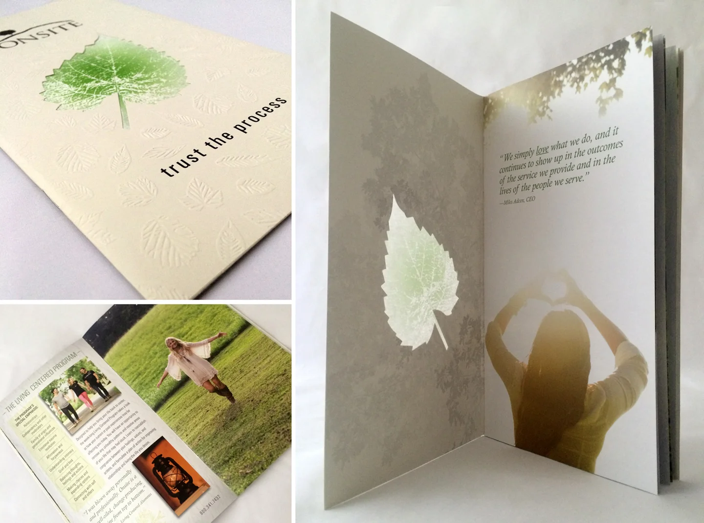
WORKSHOP CATALOG
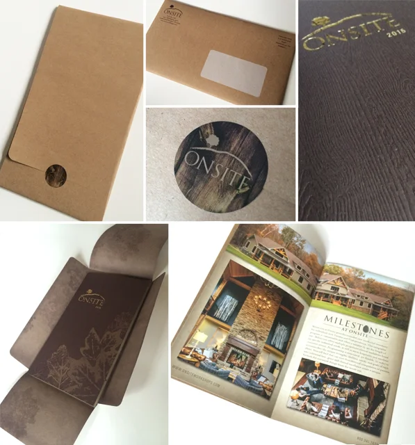
WORKSHOP CATALOG & CUSTOM MAILER PACKAGING
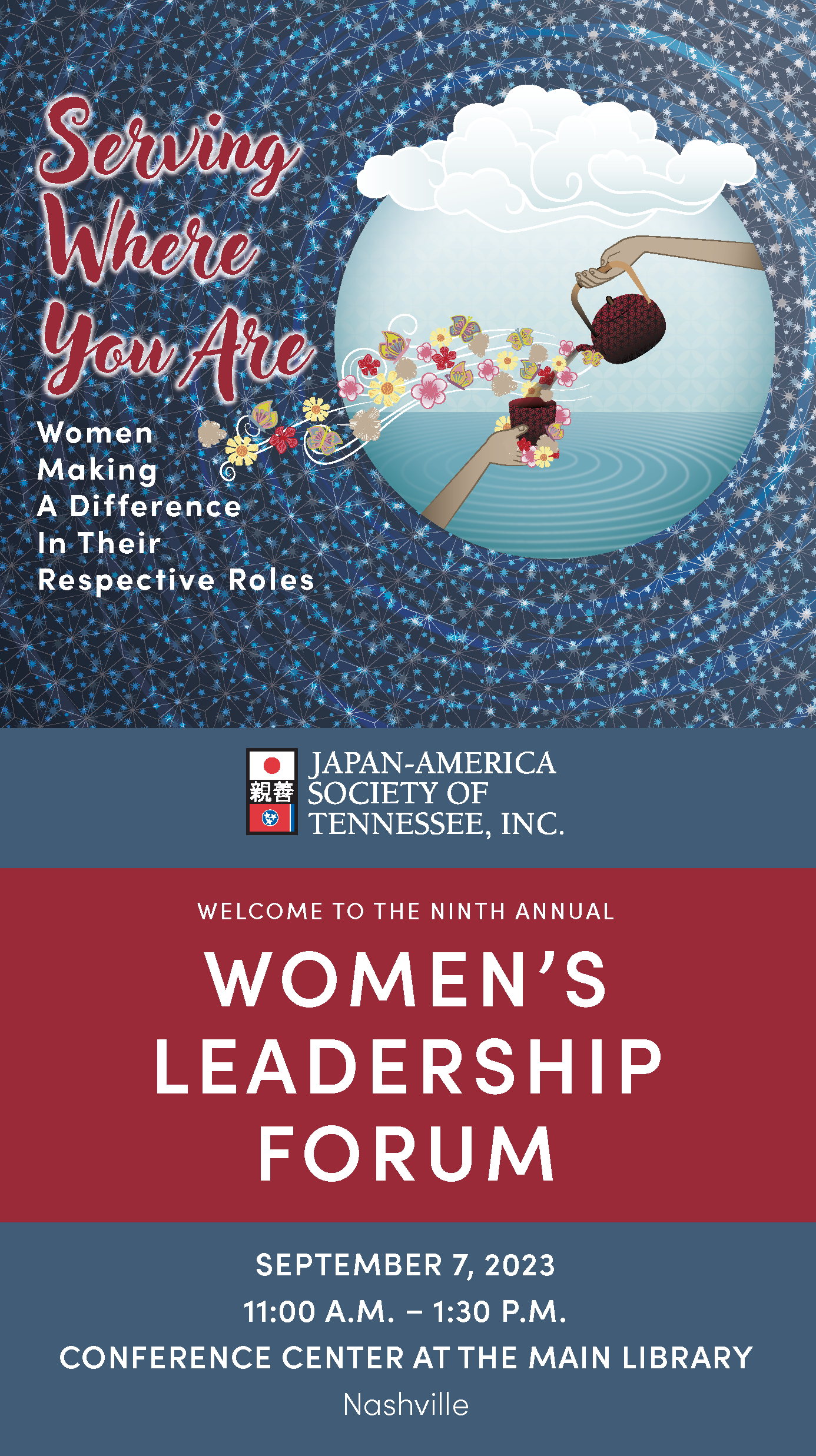
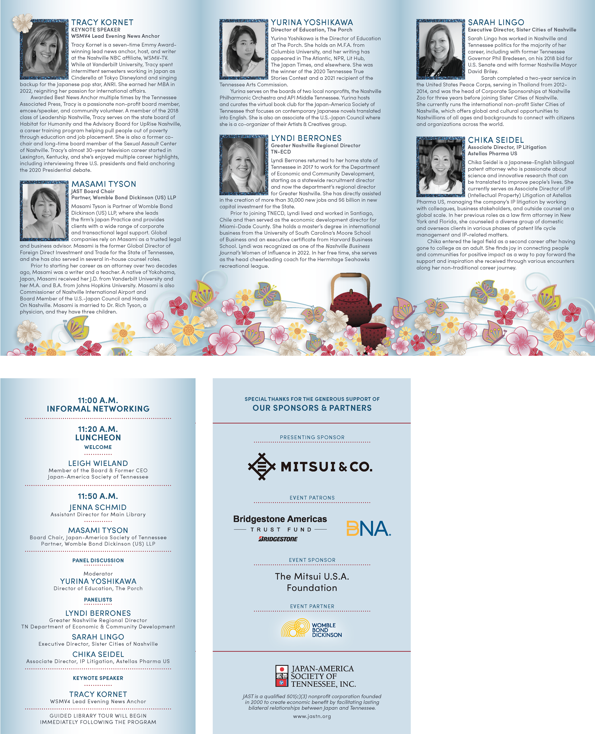
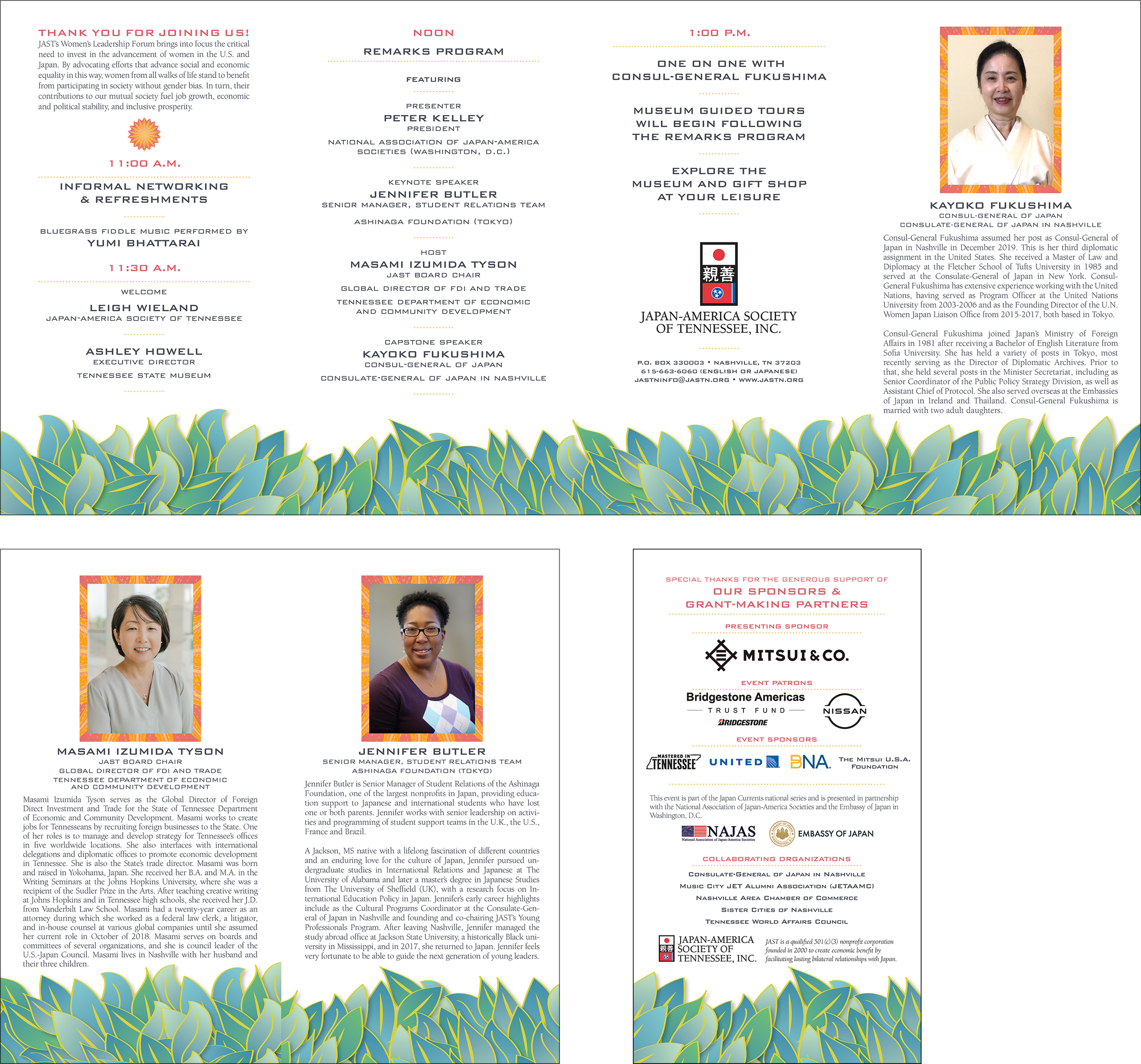
JAPAN-AMERICA SOCIETY OF TENNESSEE WOMEN’S LEADERSHIP FORUM
Japan-America Society of Tennessee (JAST) presented this first annual event for women in 2014 for members and friends of the non-profit and its Japanese community. It has come to be called the Women’s Leadership forum and was created and each year it has shown growth in public interest and attendance. And each year a theme is developed for the keynote speaker and panelists to address women’s issues both in the workplace and in life. I love interpreting the theme each year with graphics and/or illustrations that carry through the entire event’s promotion. Graphics for this fabulous and inspiring luncheon include ads, programs, menu cards, name tags and more. Every person in attendance walks away with some great ideas and tools to consider and implement in the roles they carry through their lives.
WOMEN’S LEADERSHIP FORUM 2023 PROGRAM
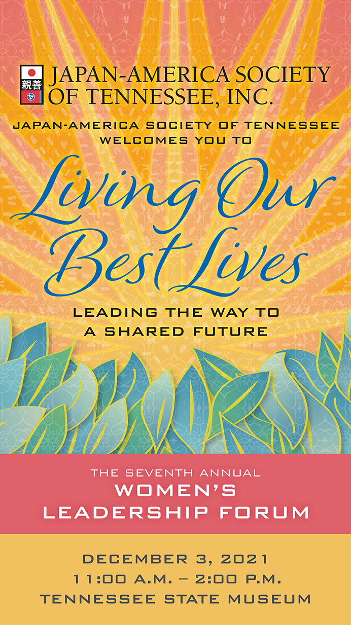
WOMEN’S LEADERSHIP FORUM 2021 PROGRAM
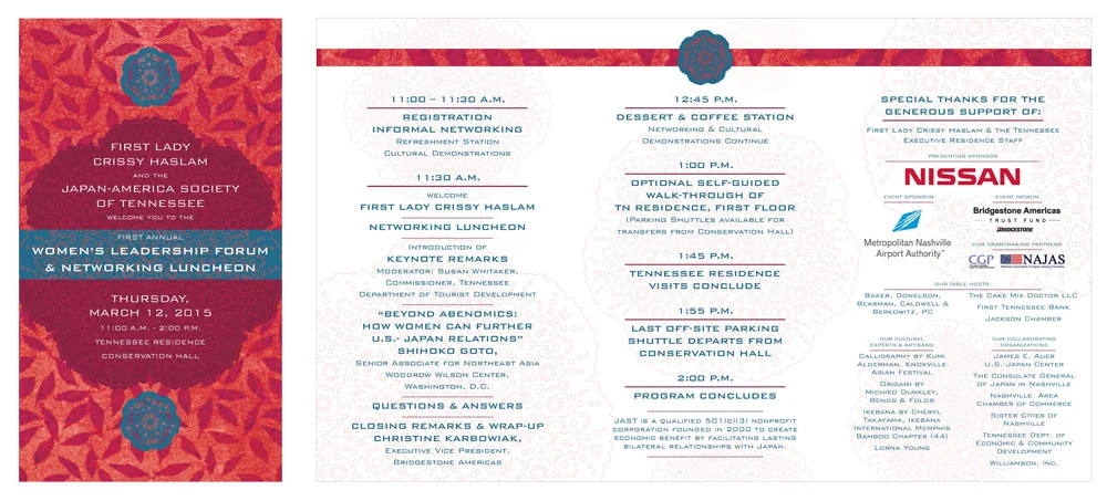
WOMEN’S LEADERSHIP FORUM 2015 PROGRAM
JAPAN AMERICA SOCIETY OF TENNESSEE - Memphis Japan Festival
Creating branding has always been a large part of the Studio Haus history. After developing and building upon the recognition of the Nashville Cherry Blossom Festival’s brand over the years, my wonderful clients came back for the development of the Memphis Japan Festival’s branding which they began to manage in the fall of 2017. Since these two festivals are being managed by the same group, we decided it would make sense to give the Memphis Japan Festival a uniquely recognizable look while also having some graphic affiliation with the Nashville Cherry Blossom Festival. Nashville’s Cherry Blossom festival is held in the spring and the Memphis Japan Festival takes place in the fall. The colors and blossoms of Nashville’s springtime festival didn’t apply. Hence more fall-like colors and flora. Similar lettering and compositions of the two Festivals however DID make sense. We were so happy to display the fruits (or shall I say the Japanese Maple leaves?) of our labors with this new logo and promotional materials that showcased this new direction to a new audience of kids and adults attendance to the Memphis Japan Festival experience.

MEMPHIS JAPAN FESTIVAL PROGRAM & SITE MAP


THA-TENNESSEE HOSPITAL ASSOCIATION
Each year, THA held its “largest membership meeting which focused on educational and networking opportunities for healthcare professionals” with a theme that is carried throughout the marketing campaign and ultimately the event. Prior to 2017, many of the marketing materials (save the dates, invites, program agendas, etc.) were printed and mailed but more recently, these materials were distributed digitally. Deliverables included branding for the meeting's them each year, save the date graphics, ads, environmental graphics, agendas, programs (print and digital with hyperlinks) and more.

LEADERSHIP SUMMIT PROMOTION


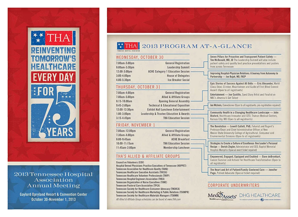
ANNUAL MEETING PROGRAM
VANSTAR
In partnership with ChandlerThinks, we were all tasked to create a series of promotional materials and ads to encourage van-pooling for VanStar. The question for our creative team’s brainstorming was, “How do we get people to give up their cars for a few hours and ride share to work?” The clever and creative copywriter Kevin Endres came up with the perfect answer. After reading the headline, who can resist learning more about the program? The copy gets right to the point. The vehicle photography is perfectly shot by the talented Sheri O'Neal Photography. The graphics support the message with a quick read. Pieces developed for the campaign included: an ad and direct mail brochure targeted for workers who commute long distances a brochure targeted for human resource directors. VanStar’s services deserve a place in the spotlight and their target audience isn't the only group that benefits by utilizing their services: the community as a whole gains too. Yet another benefit: van-pooling can be its own micro-community on wheels.
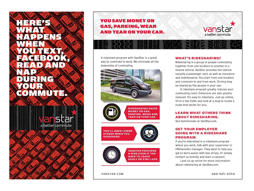
PROMOTIONAL BROCHURE (targeted for workers commuting long distances)
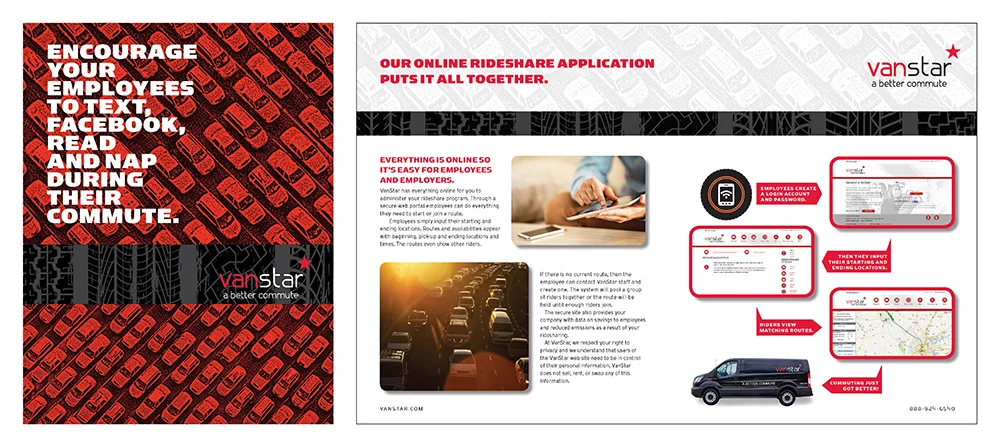
PROMOTIONAL BROCHURE (targeted for human resource directors)
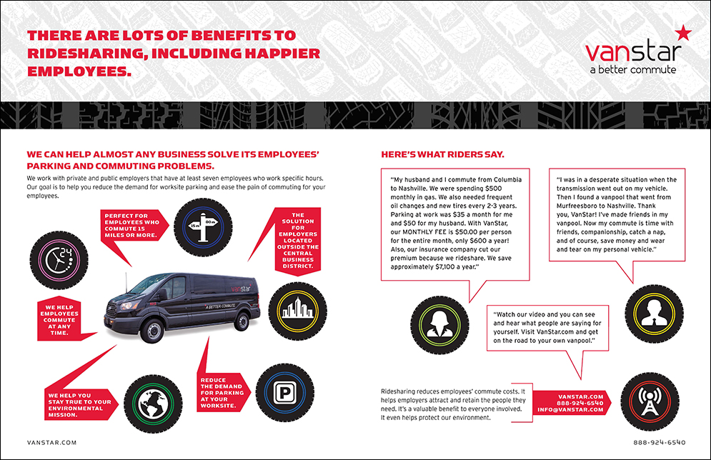
PROMOTIONAL BROCHURE (targeted for human resource directors)
The Curb Center at Vanderbilt UNIVERSITY
International affiliations with Americans are not uncommon in business communities and communicating with these audiences in mind requires the use of their native languages. Over the years, Spanish, Japanese and Chinese have all been part of the design process. Finding ways to make the language visually appealing while also relying on the interpreters expertise presents a lovely and welcome challenge to the layout process. These case studies for the Curb Center at Vanderbilt University are a case in point.
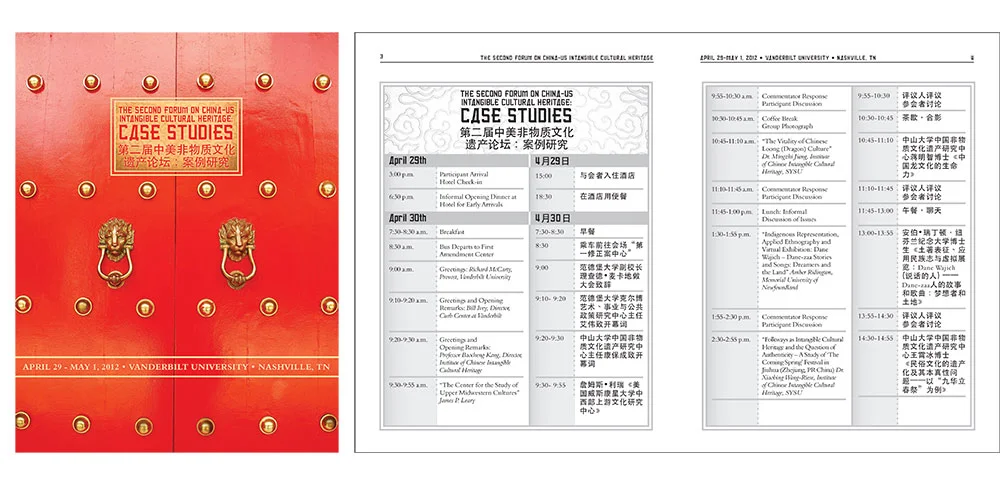
THE SECOND FORUM ON CHINA-U.S. INTANGIBLE CULTURAL HERITAGE CASE STUDIES
EDUCATIONAL PROGRAMS
Distilling a complex subject matter down to one instantly understandable image was quite a fun challenge. Making several of them all recognizable as a brand was too. These post cards were great communicators and calls to action, each with an attention-grabbing headline on the front (paired with a relevant image) and all the additional details on the back. Simplicity is a good thing!
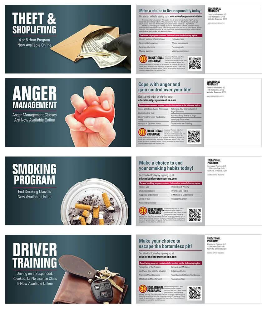
PROMOTIONAL POST CARDS
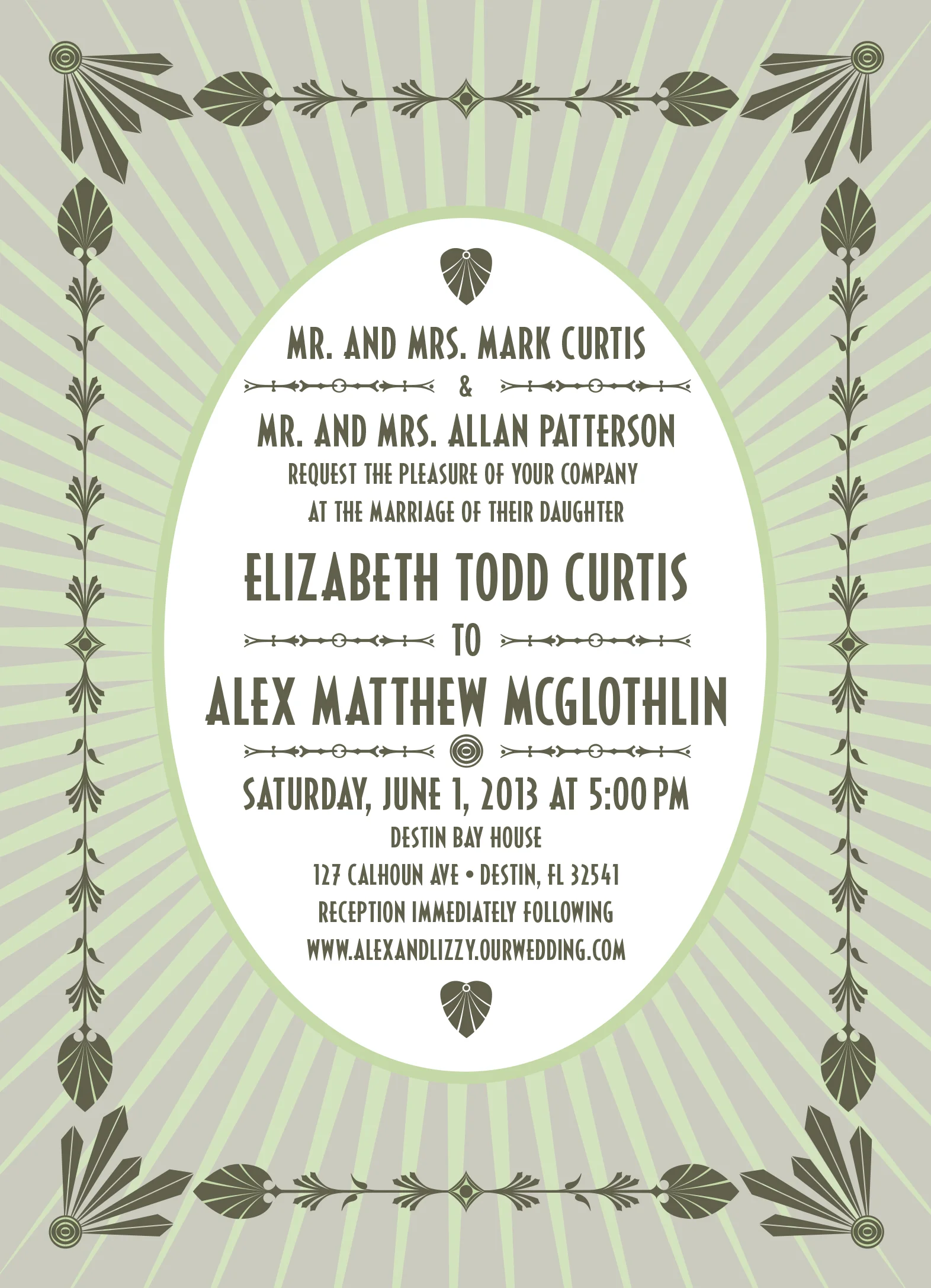
WEDDING INVITATION

FOUNDATIONS ASSOCIATES
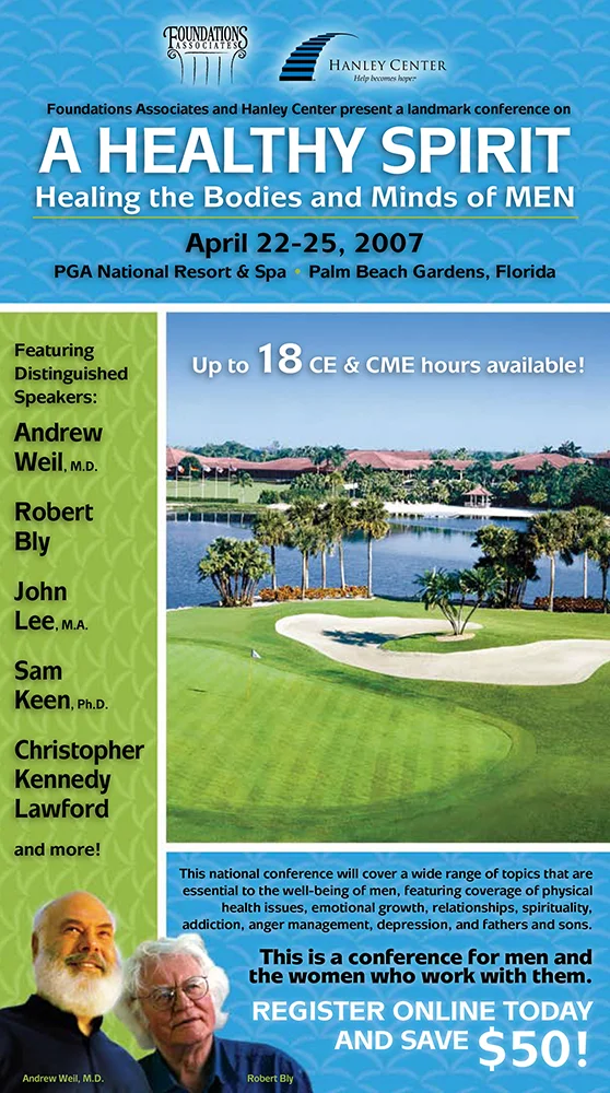
CONFERENCE PROMOTION MAILER
THE CANYON AT PEACE PARK
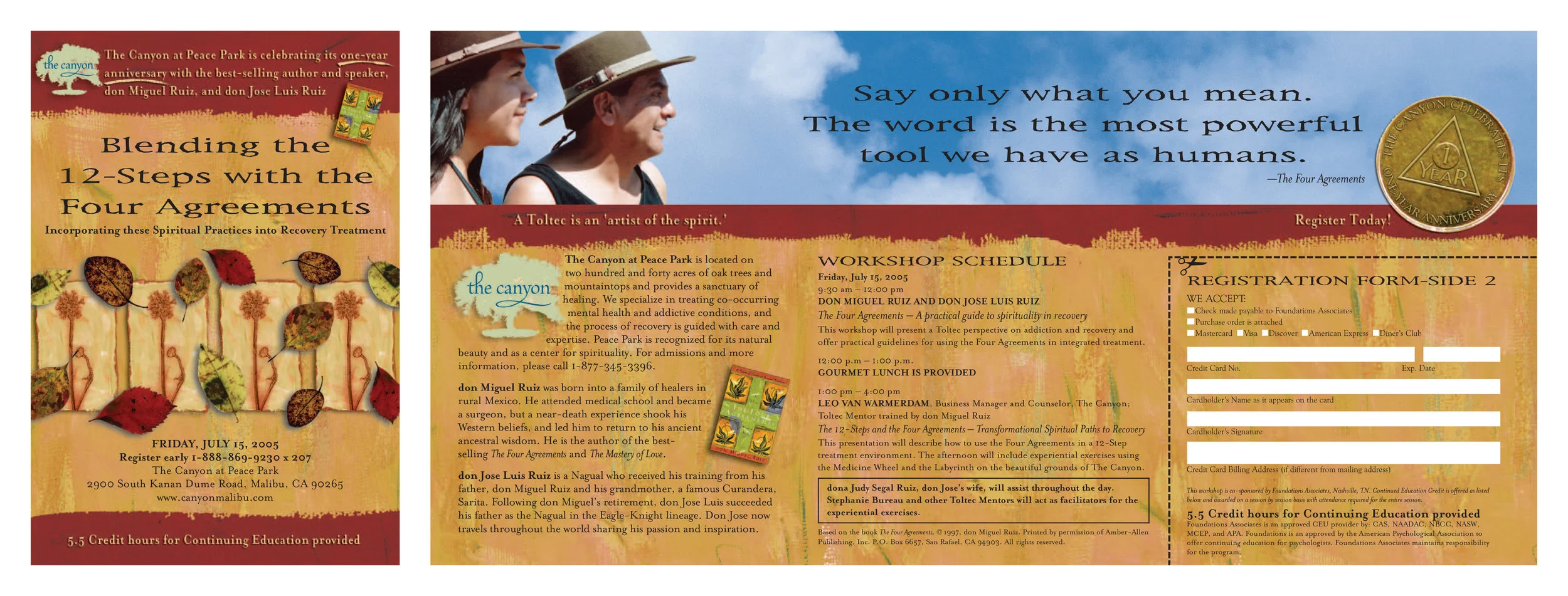
RECOVERY WORKSHOP PROMOTIONAL BROCHURE
Hammock Publishing
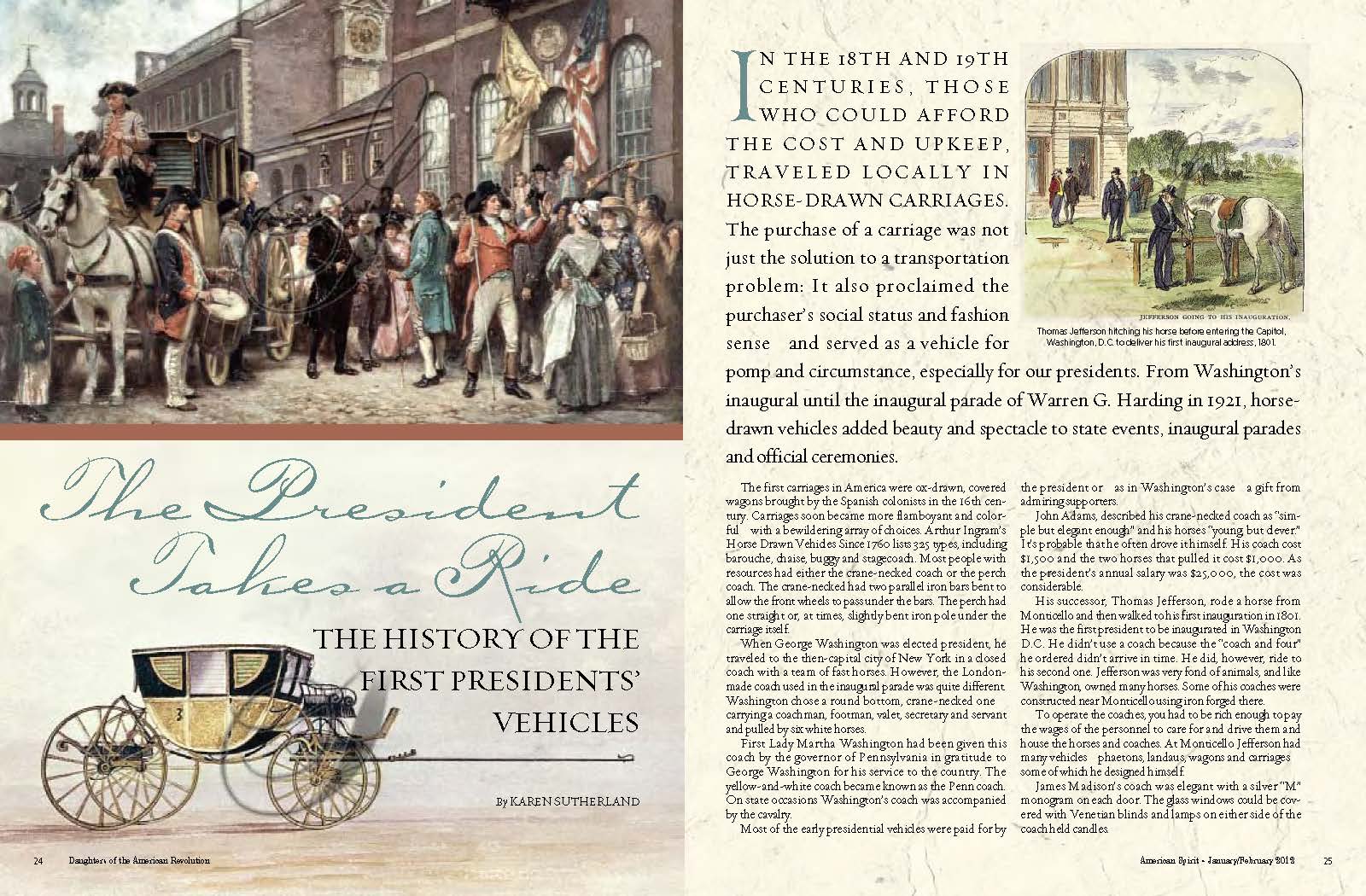
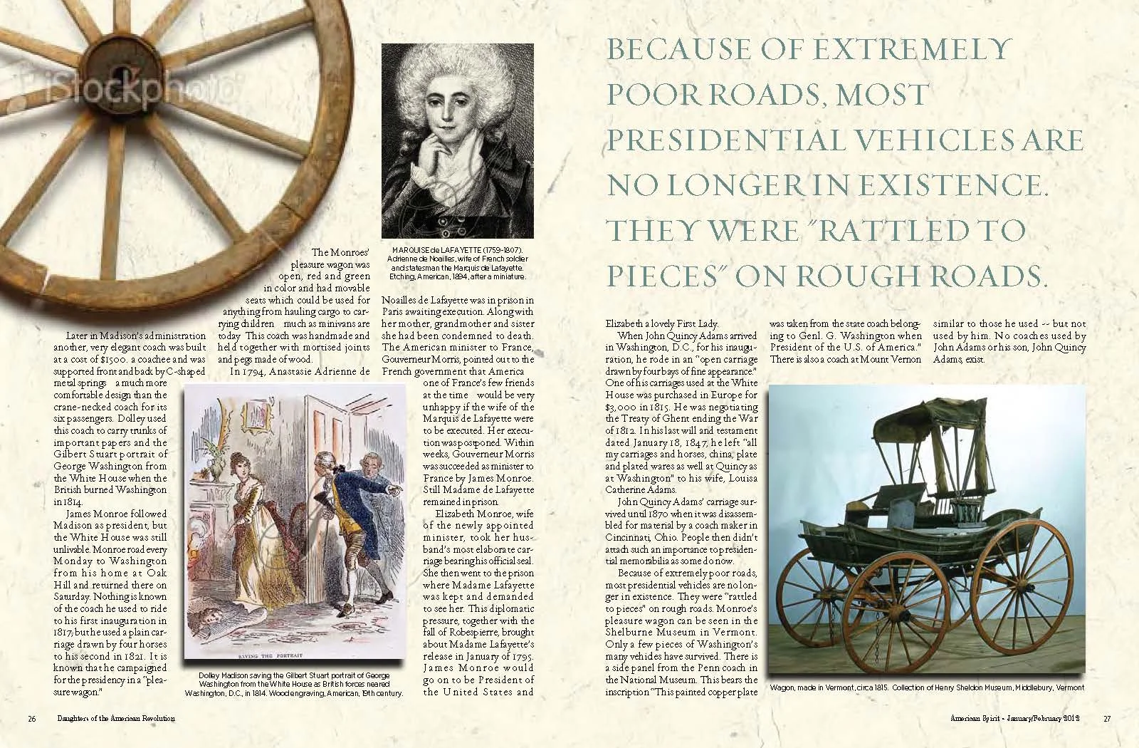
AMERICAN SPIRIT MAGAZINE ARTICLE SPREAD
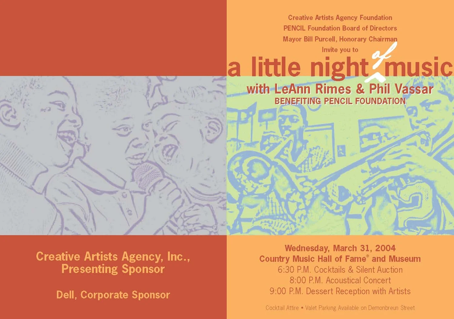
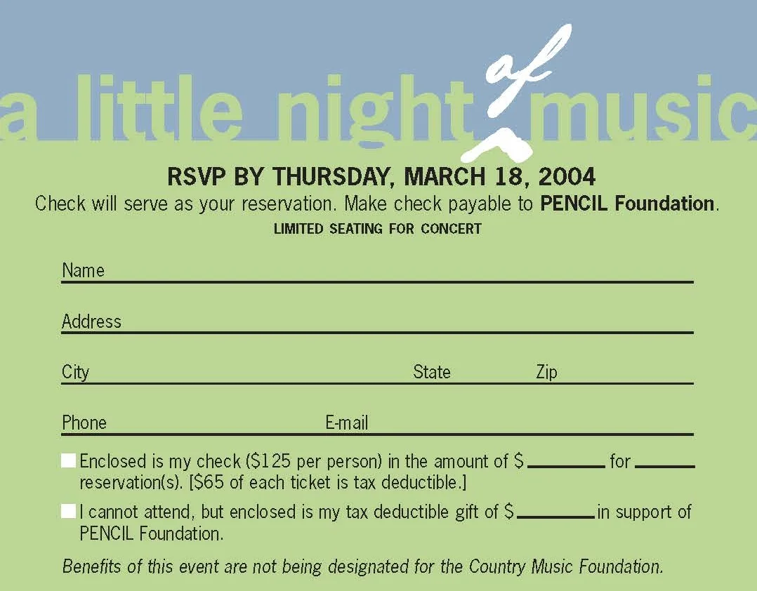
PENCIL FOUNDATION
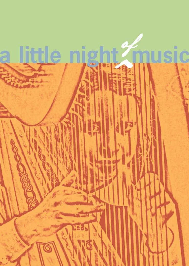
A LITTLE NIGHT OF MUSIC BENEFIT INVITATION
FOUNDATIONS RECOVERY NETWORK
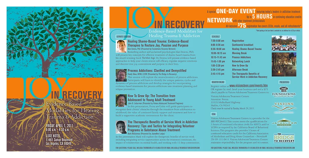
JOY IN RECOVERY WORKSHOP PROMOTIONAL BROCHURE
INTEGRATIVE WELLNESS COACHING
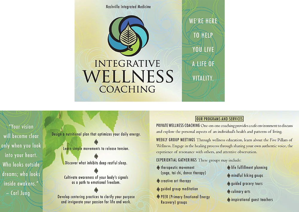
PROMOTIONAL BROCHURE
PET COMMUNITY CENTER
A non-profit is nearly always in need of guidance with graphics and I was thrilled to work with this one in Nashville, TN. In an effort to reduce and ultimately eliminate euthanasia rates of strays, surrendered animals, or unwanted births, Pet Community Center sought to provide no or low cost spay and neuter programs throughout Tennessee. This often meant asking for donations while also providing these very services. Infographics were often the form of communication, whether through ads, flyers, brochures, social media or other outlets. This grass roots non-profit subsequently grew in great popularity to meet the needs of many other communities in surrounding Nashville areas.
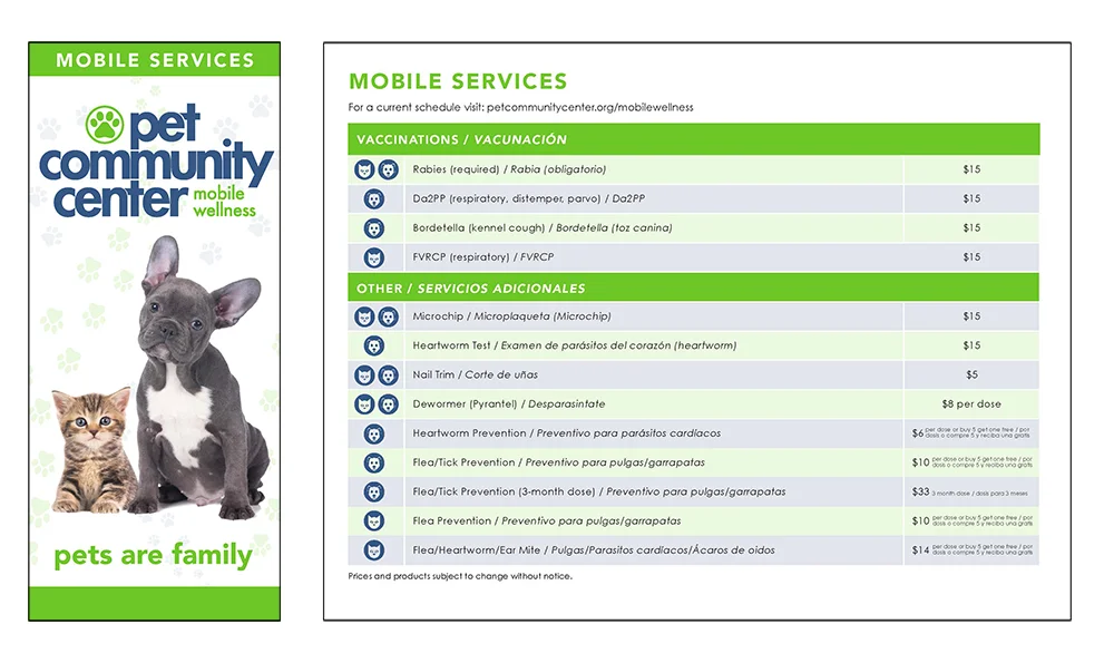
MOBILE SERVICES PROMOTIONAL BROCHURE
PEDESTAL FOODS

PROMOTIONAL BROCHURE
RESORT QUEST
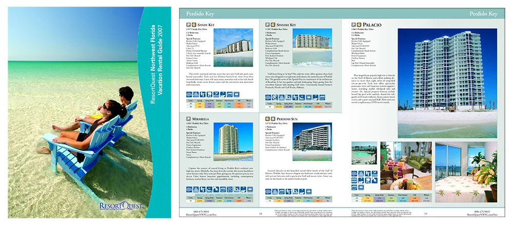
RESORTQUEST NORTHWEST FLORIDA VACATION RENTAL GUIDE 2007
BRENTWOOD BENSON MUSIC PUBLISHING
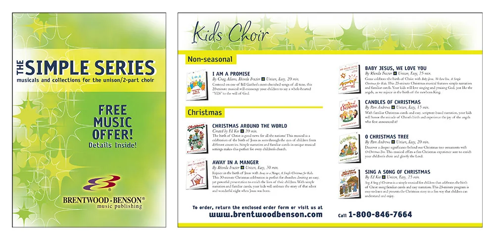
SIMPLE SERIES MUSIC CATALOG